
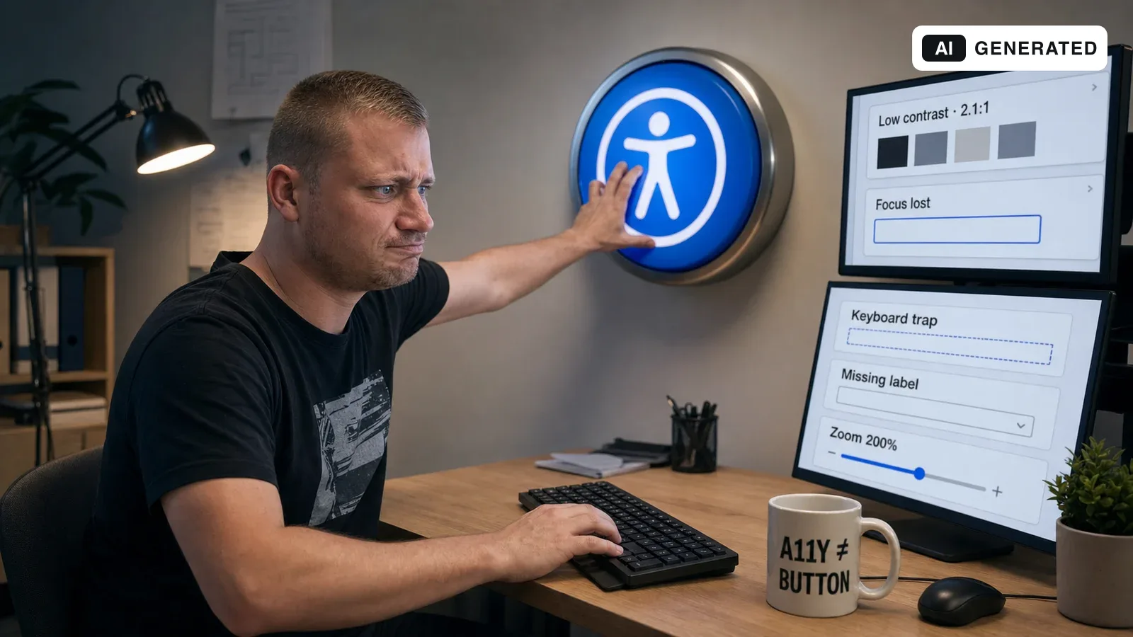
The essentials in 60 seconds / tl;dr
- An accessibility menu can support individual presentation preferences. It cannot make an otherwise inaccessible website accessible.
- The foundation is semantic HTML, understandable names and labels, logical headings, complete keyboard operation and visible focus states.
- Automated tools find many common errors quickly. Whether a journey is genuinely understandable and operable still requires manual evaluation.
- The Paulus work combined a skip link, language metadata, improved focus, reduced motion and persistent presentation preferences.
- My main lesson: accessibility is not a one-off feature. Every new navigation, dialog and form can introduce fresh barriers.
01
Why I rebuilt the Paulus website in March 2026
The starting point was neither legislation nor a client brief. The website looked clean and responsive, but I wanted to understand how it behaved for people who did not use my preferred combination of screen, mouse, standard text size and motion settings.
That became a broader accessibility pass on 7 and 8 March 2026. I added a skip link to the main content, improved focus states and keyboard routes, synchronised document language and built a settings menu for different visual and motor needs. Preferences are stored locally in the browser.
The visible menu is easy to demonstrate. In hindsight it is only the surface of a broader concern: the website must already be understandable and operable in its default state.
02
Most of the real work is invisible
Accessibility starts in the default interface. These foundations help screen-reader and keyboard users, while often improving maintainability, SEO and usability for everyone else.
Semantic structure
Headings, navigation, main content, buttons, links and forms must be marked up according to their real purpose. A clickable div remains a poor control no matter how it is styled.
Document language
The lang attribute follows the German or English view on the Paulus website, allowing screen readers to select suitable pronunciation and language rules.
Keyboard and focus
Interactive elements must be reachable in a logical order. Focus must remain visible and must neither disappear nor become trapped in menus and dialogs.
Skip to content
A skip link lets keyboard users bypass repeated navigation. It stays unobtrusive in the visual layout and appears when it receives keyboard focus.
Motion and contrast
System preferences such as reduced motion should be respected. Text, controls and focus indicators need sufficient contrast before an extra menu is opened.
Names and feedback
Icons, inputs, error messages and status changes need understandable, programmatically determinable labels. Visual proximity alone does not establish the relationship.
WCAG 2.2 organises these requirements around perceivable, operable, understandable and robust content. It is not a component library, but a set of testable success criteria for content and journeys.
05
An automated score of 100 is a starting point, not a certificate
The existing Lighthouse checks for the Paulus website scored 100 in the accessibility category. That is useful evidence that common technical errors were not overlooked, but it does not mean that every page, state and journey is fully accessible.
Automated tools can identify issues such as missing alternative text, low contrast, unlabelled form inputs and certain ARIA errors. Deciding whether alternative text is useful, focus order feels logical or an error message truly helps requires human judgement.
The W3C states this limitation clearly: evaluation tools assist the process but cannot determine accessibility on their own. I therefore combine technical checks with real interaction.
Four useful evaluation layers
Automated
Lighthouse, axe or WAVE for quickly detectable rule violations and regressions.
Keyboard
Complete every journey using Tab, Shift+Tab, Enter, Space and Escape without a mouse.
Presentation
Check zoom, narrow viewports, text spacing, dark mode, high contrast and reduced motion.
Assistive technology
Test relevant journeys with a screen reader or voice control and involve disabled users where the assurance level requires it.
The WebAIM Million 2026 report shows that the subject is far from finished: 95.9 per cent of the sampled home pages had automatically detected WCAG failures. Because automation only identifies a subset of issues, the report concludes that full conformance was lower still.
06
Accessibility law is a relevant trigger, but not the only reason
Since 28 June 2025, Germany’s Accessibility Strengthening Act has applied requirements to certain products and services. In e-commerce this is particularly relevant to services offered through websites or apps with the aim of concluding a consumer contract.
That does not mean every company website has identical obligations. Exceptions matter too: according to the Federal Accessibility Centre, micro-enterprises with fewer than ten employees and no more than two million euros in annual turnover are generally exempt where they provide services. The specific situation should still be assessed individually.
For product development, the legal minimum is too narrow a question anyway. Good keyboard operation, understandable forms and robust contrast also help people with a broken arm, tired eyes, a poor connection, bright sunlight or an unfamiliar input method. Accessibility is a quality and product decision as well as a compliance topic.
No universal legal traffic light
Whether a specific offer falls within accessibility legislation and which standards apply depends on the product, service, company size and audience. A blog article cannot replace that legal assessment.
07
A ten-minute check for your own website
This short check does not replace an audit, but it often reveals problems that remain invisible during everyday development.
Put the mouse away
Tab through the page. Is the active element always clear? Can you reach every function and leave every dialog again?
Zoom to 200 per cent
Do text and controls remain available? Does fixed navigation cover content? Is two-dimensional scrolling required?
Inspect images
Do alternative texts communicate the purpose of meaningful images? Are decorative images treated as decorative?
Submit a form incorrectly
Are errors explained clearly and associated with the right fields? Is previously entered data preserved?
Reduce motion
Does the page respect prefers-reduced-motion? Do orientation and function remain intact without animation?
Scan the headings
Does their sequence describe the page structure, or were levels selected merely for visual size?
Check contrast and colour
Do states remain recognisable without colour alone? Are text, borders and focus indicators sufficiently distinct?
If any one of these steps blocks an important journey, it is not a cosmetic defect. It is a product bug with a direct impact on users.
08
What I frame differently today
The March implementation was valuable because it made accessibility visible and technically concrete. At the same time, some early decisions show how easily accessibility is initially treated as an add-on.
One example is an option called “screen reader optimisation”. The intent was to enable additional semantics when requested. Today I would not treat that separation as the desired design: everything required for correct names, roles, states and landmarks belongs in the default output. An optional mode may enhance preferences, but it must never provide the basic access path.
Named contrast levels and a perfect automated score can also create too much confidence. Conformance does not apply to a colour or a home page in isolation, but to the actual combination of content, component, state and complete process.
What has proved useful
- modelling accessibility preferences centrally through state and CSS variables
- respecting system settings such as reduced motion early
- treating the skip link, visible focus and document language as a global foundation
- storing preferences locally and making them easy to reset
- testing new components with a keyboard as well as visually
09
Frequently asked questions
Does an accessibility menu make a website WCAG-conformant?
No. It can support individual preferences, but it replaces neither accessible structure and operation nor a complete evaluation.
Is a Lighthouse accessibility score of 100 enough?
No. It shows that the tested page performs well against automatable rules. Many questions about comprehension, focus order, alternative text and complete journeys require manual review.
Does every website fall under accessibility legislation?
No. Scope and exemptions vary. Certain products and consumer-facing services, including areas of e-commerce, are particularly relevant. The specific case should be assessed professionally or legally.
Which check usually produces the quickest insight?
A full keyboard pass through the most important user journeys. It often reveals missing focus states, incorrect elements, unusable dialogs and problematic ordering.
Should there be a special screen-reader mode?
Essential semantics should always be present. An optional mode may provide additional preferences, but it must not be a prerequisite for screen-reader access.
Is accessibility relevant only to people with permanent disabilities?
No. Temporary and situational limitations also matter, including injury, bright light, small displays, reduced attention or operation without a mouse.
10
Sources and further reading
For standards and legal context I deliberately used primary sources alongside the current WebAIM study.